ShopDreamUp AI ArtDreamUp
Deviation Actions


Description
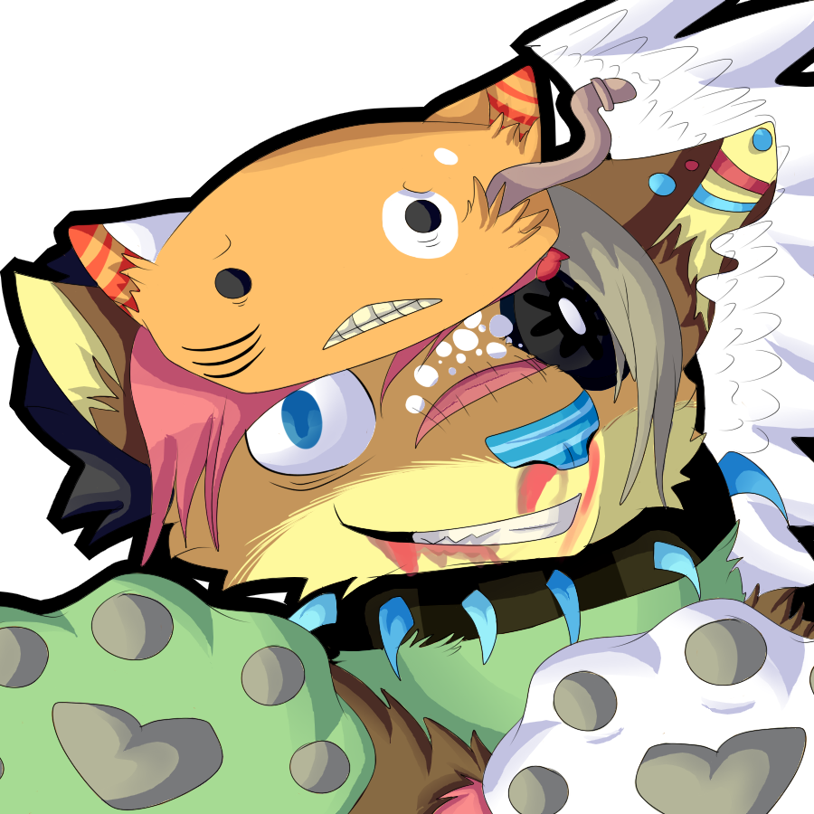
AH THIS TOOK ME LIKE 2 DAYS! AND IT WAS WORTH IT!
Okay, so I basically started the sketch (what went very quick) and then it went all slow; the lining, the colouring and the shading of this character is SO hard! So basically it took me a lot of time for this. So I really hope you like it Vulpes! Btw, I was playing around with a new style of shading, and it seems right to me C:
((forgot the blood, gonna edit that in later))
Art © Mine
Character ©
Image size
900x900px 398.85 KB
© 2014 - 2024 MayaArts
Comments3
Join the community to add your comment. Already a deviant? Log In
Cool new style of shading. Also, nice colours. I really like your use of colours for shading too.
There could be some more shading though. Like under the hat (I'm gunna assume it's a hat) and hair. Also, some of the shading doesn't make sense. Keep in mind where your lightsource is. The shading on top of the hat shouldn't be there. Remember that things have shape. Use shading to define shape and to define depth. There is two types of shading, own shading and drop shadow. Own shadow is the shadow a shape has on it's own, drop shadow is the shaadow one object drops on another object.
The feet of the creature could be more defined. Just google some dog paws, it should help. Also the head is quite lopsided. The right cheek is lower than the left cheek and the right ear is bigger than the left ear. The right side of the nose is bigger than the left side of the nose. Even when you don't know all the proportions, making characters symmetric (if not in design, in base) makes it look better.
The blood could be a little bit darker, but the smudging on it looks good. Keep up the great work. I'd like to see this colouring more from you.